It’s important to be consistent with the colours that you use when creating your website. Actually, it’s important to use consistent colours for all of your business branding, online or printed, from your business card, to the entire side of your building. Customers have a greater trust in businesses that give a coherent visual presence.
Why? It’s easy to think that red is red, a pretty common belief. But there are hundreds of shades of red. A handful of different shades used on one website will feel messy, badly organised and amateurish. These icky feelings are then often misunderstood by the viewer who subconsciously confuses them with an actual dislike of the product or brand itself.
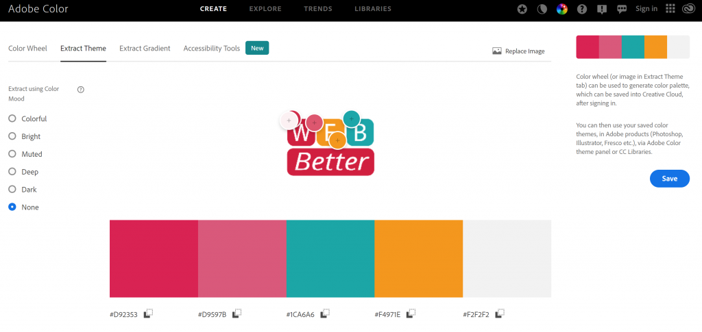
So, how do you know what red? Use Adobe Color Wheel. This is a free online program from Adobe that will help you identify the original colours used in your logo. It’s easier than you think:
- Click HERE to visit Adobe Color Wheel
- Select Extract Theme
- Upload your logo image
Adobe Color Wheel will pick each of the different colours of your logo and then give you the Hex codes for them: a # followed by a group of 6 numbers or letters (hex codes are the combination of reds, greens, and blues that make up that colour).
Once you know your brand’s hex colours, get a big marking pen and write them on your office wall. Now use only these colour codes when doing anything. You can use hex codes for custom colours on websites, Spotify stores, and even MS Word.
Another Interesting Read: The Real Reason McDonald’s Logo is Yellow and Red by Morgan Cutolo HERE
Like this post? We’d LOVE it if you LIKED us on Facebook!
